
In the hyper-competitive commercial landscape of 2026, the sidewalk has become the ultimate battlefield for consumer attention. While digital marketing and social media algorithms work tirelessly behind the scenes to capture “scroll-time,” the physical world remains the place where transactions are finalized and brand loyalty is cemented. Your sign for business outside is not merely
In the hyper-competitive commercial landscape of 2026, the sidewalk has become the ultimate battlefield for consumer attention. While digital marketing and social media algorithms work tirelessly behind the scenes to capture “scroll-time,” the physical world remains the place where transactions are finalized and brand loyalty is cemented.
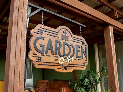
Your sign for business outside is not merely a piece of plastic, metal, or LED hardware; it is your business’s “first handshake.” It is a silent, 24/7 representative that tells the world who you are, what you value, and—most importantly—whether you are worth a stop. As the old saying goes, you never get a second chance to make a first impression, and in the world of retail and services, that first impression is often made from a car window at 40 mph or a sidewalk twenty feet away.
The Psychology of the “Split-Second Stop”
Before a customer ever tastes your coffee, tries on your apparel, or speaks to your consultants, they have already judged your quality. This is known as the “Quality Transfer” effect. If your exterior signage is vibrant, professionally designed, and well-maintained, the human brain subconsciously transfers those attributes to your internal operations.
Conversely, a faded, peeling, or flickering sign sends a signal of neglect. In the mind of a 2026 consumer, if you can’t bother to maintain your public face, you likely aren’t maintaining your quality standards behind the counter. Designing the perfect sign for business outside is about mastering the psychology of trust before the front door even opens.
The Science of Visibility: Making the Math Work
A sign is useless if it cannot be read. While “artistic flair” is important, the physics of legibility must come first. In signage design, we often use a standard formula to determine the necessary letter height for maximum impact.
The Rule of Thumb: You generally need 1 inch of letter height for every 10 feet of viewing distance to be legible, but for “impactful” readability, we recommend a slightly more aggressive scale.
For a sign to be truly effective for drivers, we look at the following relationship:
Where:
-
$H$ is the letter height in inches.
-
$D$ is the distance from the viewer in feet.
-
$C$ is a constant for “conspicuousness” (usually adding 2-4 inches for high-speed traffic areas).
If your business is located on a road where traffic moves at 45 mph, your sign for business outside needs to be legible from at least 400 feet away to give a driver enough time to react, signal, and turn. This means your primary text should be at least 40 to 45 inches tall.
High-Contrast: The Secret to Legibility
Color choice is where many businesses fail. While you may love a “subtle” tone-on-tone look for your interior branding, your exterior signage requires high contrast to break through the visual noise of the outdoors.
Best Color Combinations for Outdoor Signs
| Contrast Level | Text Color | Background Color |
| Highest | Black | Yellow |
| Excellent | White | Blue |
| Classic | Black | White |
| High Impact | White | Red |
| Poor (Avoid) | Red | Green |
In 2026, we also have to consider “Light Pollution” and “Visual Clutter.” A sign that is too bright can be as unreadable as one that is too dim. The goal is to find the “Goldilocks Zone” of luminance where the sign pops without blinding the passerby.
Digital vs. Static: The 2026 Hybrid Trend
As we move through 2026, the most successful businesses are moving toward a hybrid approach for their sign for business outside.
- The Static Anchor: Your primary brand name and logo should often remain a high-quality static element—think 3D channel letters or a sleek metal cabinet. This provides a sense of permanence and stability.
- The Digital Dynamic: Below or adjacent to the anchor, an integrated LED message center allows you to speak to the community in real-time.
Why go digital? Because it allows you to solve the “relevance” problem. A static sign says the same thing on a rainy Tuesday as it does on a sunny Saturday. A digital sign, however, can pivot: “Hot Cocoa for a Rainy Day” at 10:00 AM becomes “Happy Hour Starts Now!” at 4:00 PM. This level of agility is what defines modern retail success.
Material Matters: Durability is a Brand Statement
An outdoor sign faces a brutal environment: UV rays, freezing rain, high winds, and urban pollution. Choosing cheap materials is a “false economy” that will cost you more in brand equity than you saved in cash.
- Acrylic and Polycarbonate: Ideal for illuminated faces; they offer high clarity and impact resistance.
- Aluminum: The “gold standard” for sign cabinets because it doesn’t rust and provides a professional, high-end finish.
- High-Density Urethane (HDU): Excellent for a “carved wood” look without the warping or rotting associated with natural timber.
- LED Modules: In 2026, we prioritize “high-bin” LEDs. These ensure that the color of the light remains consistent across the entire sign and doesn’t “yellow” or dim unevenly over time.
The ROI Factor: Why Signage is Your Cheapest Ad
Many business owners balk at the price of a custom sign for business outside, but let’s look at the math. If you spend $10,000 on a high-end sign and it lasts for 10 years, your cost is approximately $2.73 per day.
Compare that to:
-
Social Media Ads: Often costing $10–$50 per day for limited local reach.
-
Direct Mail: Thousands of dollars for a one-time “hit” that mostly ends up in the recycling bin.
Your sign is the only marketing tool you own that works for you while you sleep, during holidays, and in the middle of a storm. It is a one-time capital investment that pays dividends every time someone says, “I saw your sign and decided to stop in.”
Legalities and “Good Neighbor” Design
Before falling in love with a 50-foot pylon sign, you must consult local zoning laws. In 2026, many cities have implemented “Dark Sky” compliance rules to reduce light pollution.
-
Permit Procurement: Never start fabrication before you have a permit in hand. Zoning officers can be strict about “Sign-to-Façade” ratios.
-
Neighborhood Harmony: Your sign should stand out, but it shouldn’t be an eyesore. A sleek, modern sign in a historic district will get you noticed, but perhaps for the wrong reasons. The “perfect” sign respects the architecture of the building it sits on.
Conclusion: Take Your Business Out of the Shadows
Designing the perfect sign for business outside is a blend of art, engineering, and psychology. It requires you to step out of your own shoes and view your storefront through the eyes of a busy, distracted, and skeptical stranger.
Does your sign answer the three critical questions in under three seconds?
- Who are you?
- What do you do?
- Are you professional?
If the answer is a resounding “Yes,” you have successfully created an asset that will drive growth for years to come. Don’t let your business be the best-kept secret in town. Invest in the light, the contrast, and the quality that your brand deserves.